Design system & full product redesign
Rebuilding a live product as a token-driven design system
The ground-up redesign of the ePOINT app: a token architecture built before a single screen was drawn, 422 dual-theme screens, a working dark mode driven by 7,637 variable bindings, and a 13-part engineering handoff.
Backdrop — the actual working file
- Role
- Design Lead — end-to-end
- Client
- ePOINT · EU market
- Period
- 2026
- Platforms
- iOS · Android (React Native)
- Tools
- Figma (variables, modes, Plugin API) · Claude Code
- Status
- Delivered — migration to the live app in progress
Overview
ePOINT serves two very different users — customers earning points and dealers running stores. v2.0 is the ground-up redesign that carries the 2026 rebrand: legacy green gave way to teal, a Roboto type scale, and a component library built before a single screen was drawn.
The premise: at 400+ screens, craft is an engineering problem. Tokens, scripted audits and mode-driven theming are what make quality repeatable — taste alone does not scale.
Scope
- Design tokens & variable architecture
- Component library
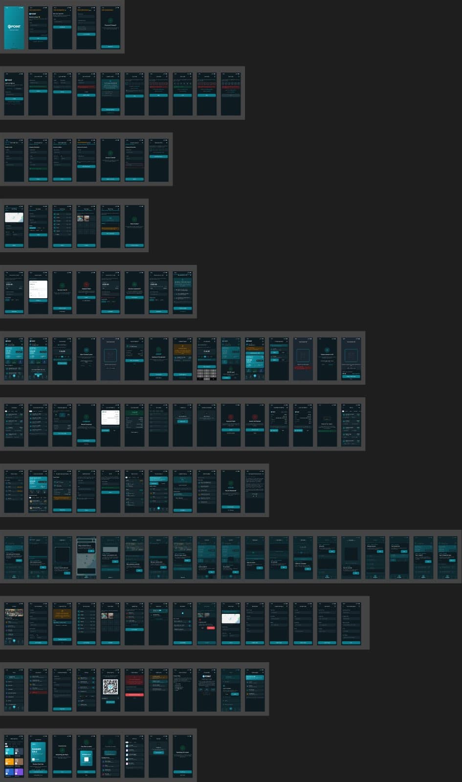
- 211 screens × 2 themes
- WCAG contrast auditing
- Design ops (scripted Figma passes)
- Engineering handoff specification
Figures counted from the working files — not estimates
The challenge
Redesign a live, revenue-carrying product without freezing it: the new system had to cover every existing workflow, add v4 features, and produce a dark mode that actually works — not a color-inverted afterthought.
The scale made manual quality impossible. No one hand-checks contrast on 422 screens; the process had to be built so correctness was verifiable by script.
My role
Design lead, end to end: token architecture, component library, and the full screen set in both themes — plus flow maps, documentation and handoff. Built hands-on, with scripted design-ops passes doing the heavy lifting.
Design ops: large files are maintained with scripted Figma Plugin API passes — variable-binding sweeps, sibling-aware WCAG contrast audits, layout linting, icon indexing. Craft at this scale needs tooling, not heroics.
Review orchestration: an 8-persona expert review — merchant, customer, PM, engineer among them — ran before delivery, and its findings were triaged into system fixes and new screens.
Product decisions
5 that shaped the productBuild the token collection and component library before drawing any screen.
WhyScreens drawn first become debt the moment a system arrives; tokens drawn first make every screen a proof of the system.
Impact26 color + 13 numeric tokens with light/dark values, an 81-variant button set, inputs with OTP states, role-specific nav bars — 211 screens then rendered from the same foundations.
Treat dark mode as a mode, not a filter.
WhyInverted colors break finance UI: white cards, unreadable status text, buttons that lose contrast.
Impact7,637 variable bindings mean 211 dark twins render by switching the collection mode. External webviews deliberately stay light. A sibling-aware WCAG audit closed with zero invisible text in either theme.
Assign accent colors by function, not by taste.
WhyIn data-heavy lists, hue is the fastest scanning signal a user has.
ImpactBlue = finance, violet = referral & security, pink = promo, amber = energy. An icon chip's color tells you what a row does before you read it.
Ship the system with a 13-part engineering handoff, not just screens.
WhyA design system that ignores async states, VAT scenarios and i18n is a picture book, not a spec.
ImpactAsync-state triples, webview failure modes, the VAT matrix, motion tokens, per-screen acceptance criteria — the questions engineering would ask, answered before they were asked.
Run an 8-persona expert review before calling it done.
WhyA system that only survives the designer's own eyes hasn't been tested.
ImpactFindings were split into refuted claims (verified against the file), system-level fixes (contrast, type scale), and 20+ new screens — recovery states, permission flows, KYC proposal — each with its dark twin.
Foundations
Tokens first, screens second
The foundations pages document colors, typography, spacing, elevation and the dark-mode contract — the rules that make 422 screens feel like one product.
Every color decision resolves to a token with explicit light and dark values. Special cases are named, not improvised: fixed-white for printed matter, a dedicated primary-button token because bright teal fails contrast under white text in dark mode.
Component library
An 81-variant vocabulary
Buttons across three hierarchies, three sizes, icon positions and states; inputs with OTP variants; nav bars per role; headers, badges, modal and toast systems — plus a 1,695-icon library indexed for scripted use.
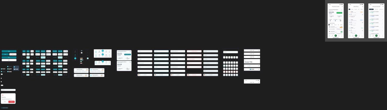
Buttons — 81 variants, one set
Inputs & OTP — every state named
Why it mattered
Consistency — one vocabulary across 400+ screens
Speed — new screens assemble instead of being drawn
Handoff — engineers bind tokens, not guesses
Screens at scale
Two products, one system
The dealer side runs the business: cashback, reloads, commissions, invoices, store management, marketing tools. The customer side earns: home, map discovery, online shops, redemption, payout tracking.
Dark mode
One mode switch away
The same 108 dealer frames, rendered dark by switching the token collection mode — no redrawing, no per-screen overrides. This is what 7,637 bindings buy: a theme as a property of the system, not a second project.
Key screens
The system in use
Hero balance cards anchor the brand teal; functional accents route attention in lists; the Amazon flow keeps its tracking bar; redemption shows both thresholds honestly instead of forcing a detour.
Flows & assets
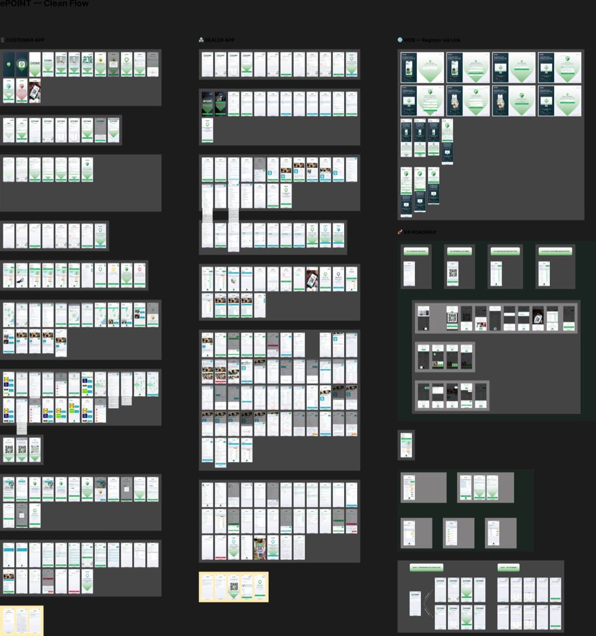
Journey maps and the icon wall
Role-based journey maps document how screens chain into flows — dealer and customer journeys, theming rules, and a proposed KYC flow explicitly flagged as not-yet-in-app. The assets page holds the raw material: 1,695 icons, device kits, status bars, flags.
Outcome
verified, qualitative where honest- 01
A delivered, documented system: 422 screens, four flow maps, foundations docs and a 13-part engineering handoff.
- 02
Dark mode proven by construction — zero invisible-text findings in either theme after sibling-aware WCAG audits.
- 03
The system is now migrating into the live React Native app — theme provider, token mapping, phased screen swaps — by the same hands that drew it.
More projects
ePOINT
Product clarity for a multi-sided loyalty ecosystem
Read case →
BestPrime
A premium dark partner platform, made ready for the app stores
Read case →DecentraHubs
Running a product studio — from brand systems to shipped software
Read case →