Loyalty & cashback platform
Product clarity for a multi-sided loyalty ecosystem
A merchant-driven cashback ecosystem connecting customers, dealers and backoffice operations — mobile apps, QR flows, commissions, payouts, invoices and onboarding, evolving toward blockchain-facing concepts.
Backdrop — the actual working file
- Role
- Product Manager · Product Owner · Product Designer
- Client
- ePOINT · EU market
- Period
- Ongoing · Version 4 in development
- Platforms
- iOS · Android (React Native) · Web · Backoffice
- Tools
- Figma · Trello · Jira · Claude Code · Maestro
- Status
- Live product, active development
Overview
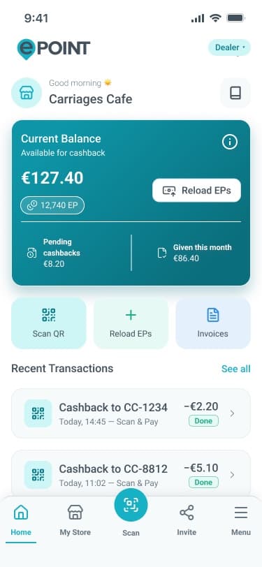
ePOINT is a cashback and loyalty platform for the EU market: customers earn Energy Points at partner merchants, dealers run stores and fund cashback, and a backoffice ties commissions, payouts, invoices and affiliate structures together. One product, four very different users — each with their own workflows, incentives and failure modes.
I own product and design direction across the ecosystem: turning business rules into flows, flows into interfaces, and interfaces into implementation-ready work for mobile, backend and backoffice teams.
Scope
- Product management & requirements
- UX architecture & flows
- Feature design in a legacy system
- Information architecture (product atlas)
- QA strategy & regression testing
- Stakeholder alignment & delivery
Figures counted from the working files — not estimates
The challenge
The product had grown feature by feature across years and versions. Business rules were real and non-negotiable — VAT scenarios, payout thresholds, commission margins, activation pricing — but they lived in code, contracts and people's heads rather than in one coherent product picture.
Every new feature had to respect three constraints at once: an existing backend with fixed business logic, a live app that customers and dealers used daily, and a design language that was mid-transition between generations.
My role
Product management: translating stakeholder requests into structured requirements, sprint-ready tasks and acceptance criteria; running the Trello-based QA and delivery boards.
Product design: designing v4 features — flyer generator, passwordless login, phone migration, account selector — inside the legacy design language, by cloning production frames and rebuilding content so new screens ship without visual debt.
Information architecture: building the Clean Flow atlas — the single canonical map of the entire live product.
Quality: defining the Maestro UI test suite and persona-based regression reviews; findings flow directly to the QA board.
This is team-based work — engineering, backend and business stakeholders own their parts; I own the product and design layer that connects them.
Complexity map
Four roles, six surfaces, one core.
Every role sees a different product; every surface enforces the same business rules. The job is holding this whole graph in one coherent model — so a change on any edge is understood everywhere it lands.
From ambiguity to structure
What changed when the product got a map.
Before — ambiguity
Rules in people's heads, screens without a map.
After — structure
- One canonical atlas — 300+ screens in three role columns
- Passwordless OTP as the single canonical entry path
- A four-scenario VAT matrix inside the engineering handoff
- V4 features cloned pixel-faithful into the legacy language
- 253 automated UI tests + persona reviews feeding one QA board
- Requirements structured into sprint-ready tasks with acceptance criteria
One map, one system, one delivery rhythm.
Product decisions
4 that shaped the productProblemYears of iteration had scattered the product across pages, files and versions — nobody could answer “does this screen exist?” with confidence.
Rebuild the entire product as one canonical atlas (Clean Flow) before designing anything new.
WhyYou cannot redesign, scope or test what you cannot see. A shared map had to precede any new design work.
Impact300+ screens in three role columns became the reference for the v2 rebuild, the QA regression suite, and every scoping conversation since. Gap analysis exposed missing password, legal and settings screens — closed on the spot as clearly-flagged draft sections.
ProblemPassword resets were the top friction and support load for a mainstream, non-technical audience across four languages.
Make passwordless OTP login the canonical auth path and demote legacy password flows.
WhyOTP matches how this audience already authenticates elsewhere — and two auth paths silently coexisting would split the product.
ImpactA full OTP system — e-mail/phone entry, wrong/expired/locked states, Face ID hints — designed for both customer and dealer roles, with legacy flows explicitly labeled instead of quietly kept alive.
ProblemDealer activation (€329 net) carries four VAT scenarios driven by live VIES validation — ambiguity here becomes wrong invoices and support escalations.
Productize the hardest business logic — VAT and activation — into explicit scenario matrices.
WhyTax logic cannot be discovered in QA. Every scenario needed a designed, named state before development started.
ImpactThe 4-scenario matrix became part of the engineering handoff spec; edge cases like EU reverse charge got their own designed states instead of surfacing in production.
ProblemThe live app kept shipping while the v2 redesign was in flight — two design languages risked colliding in a single release.
Design v4 features pixel-faithful to the legacy system while the v2 redesign ran in parallel.
WhyUsers should never see the seams of an internal transition.
Impact30+ production-ready screens — flyer generator, Amazon OCR flow, passwordless, account continuity — designed native to the existing product, with the flyer generator already implemented; a system I had to respect before I could replace it.
Information architecture
Clean Flow — the product atlas
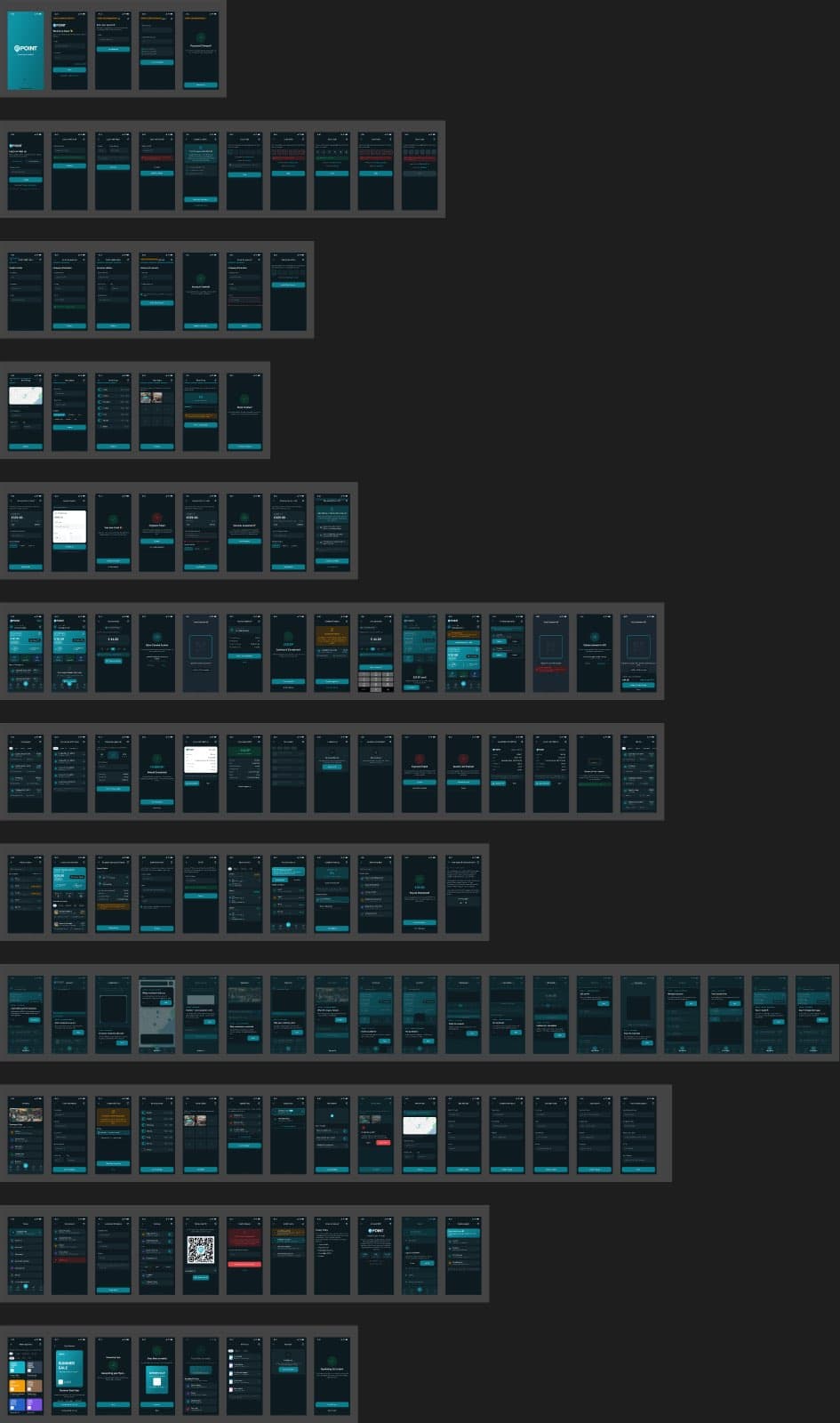
The atlas rebuilds the live app as one map: Customer (132 screens), Dealer (156) and Web + v4 roadmap columns, each holding only the latest approved version of every screen. It is the answer to the most expensive question in a long-lived product: what actually exists?
Mapping exposed the holes. Missing password, legal and settings screens were closed immediately as flagged draft sections on yellow ground — visible debt instead of invisible debt.
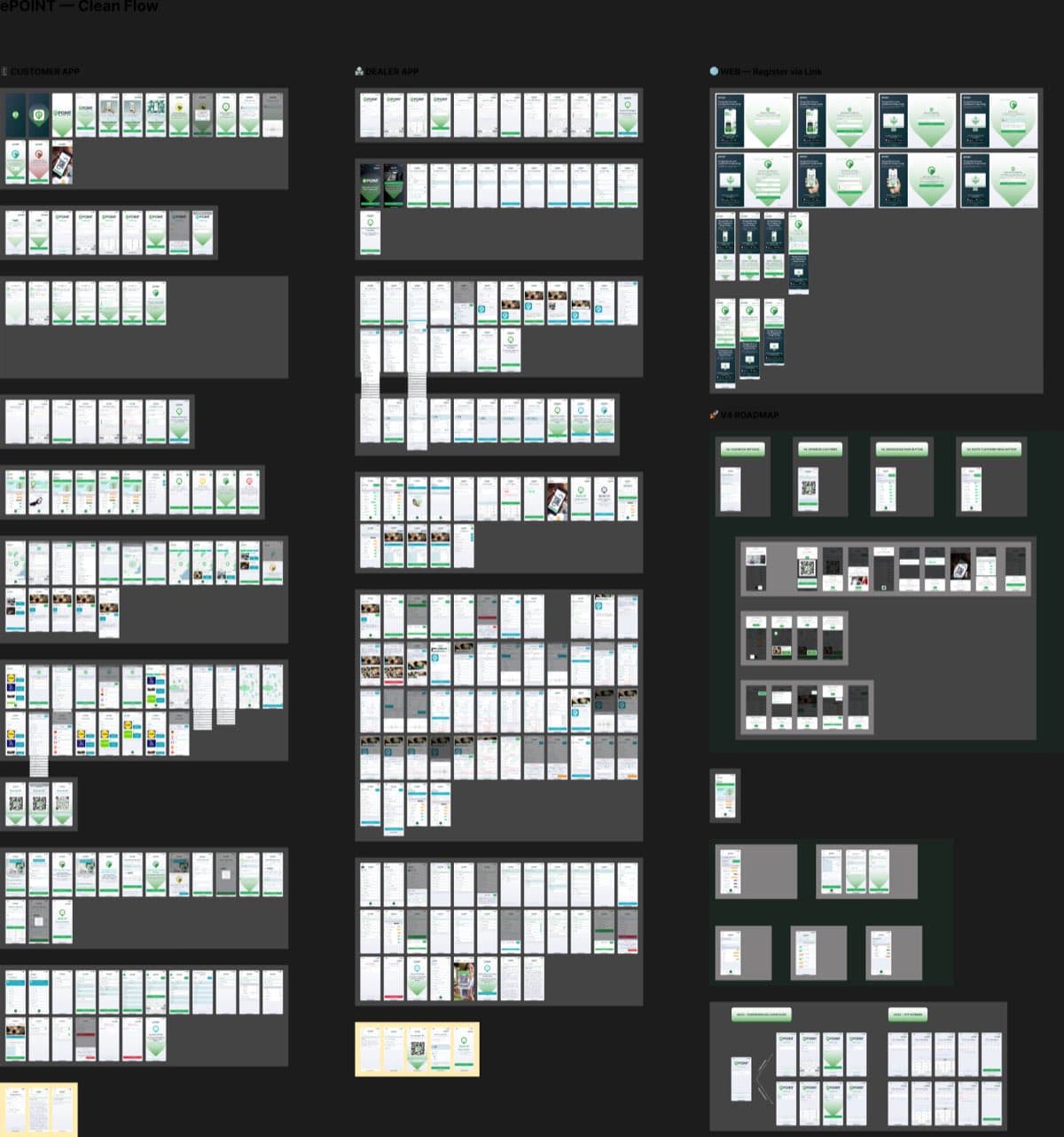
The atlas answers the most expensive question in a long-lived product: what actually exists?
Feature design
Designing v4 inside a legacy system
While the v2 redesign was in flight, version-4 features had to look native to the existing product — the original green, DM Sans, the original component vocabulary. Every new screen was built by cloning production frames and rebuilding their content.
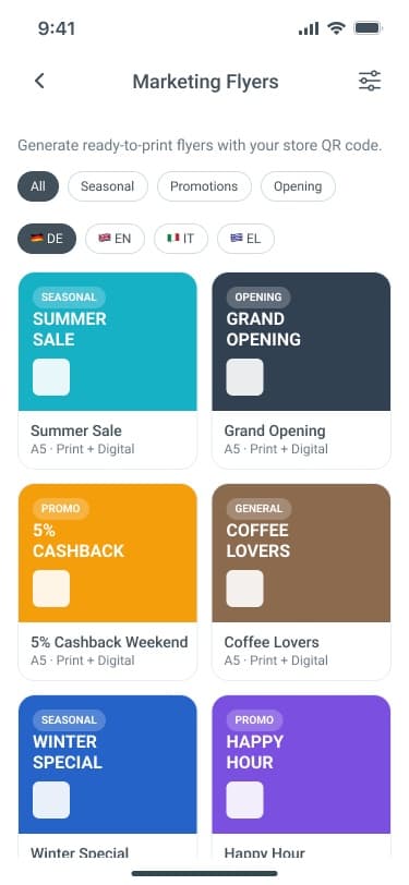
The flyer generator gives dealers a 7-screen marketing tool: template library with category and language filters (DE/EN/IT/EL), live QR auto-placement, generation states, share sheet and archive. Phone migration, a Google-style account selector for dual-role users, and app-version labeling handle account continuity.
Flow design
Amazon OCR — an eight-step trust exercise
Cashback for Amazon purchases works through an in-app shopping flow with screenshot capture at checkout and order confirmation. The design problem is trust and orientation: the user is inside a webview, mid-purchase, and needs to know the tracking is working without being interrupted.
A persistent tracking bar carries the state — current step, capture checkpoints, completion — through all eight steps, from consent to confirmed points.
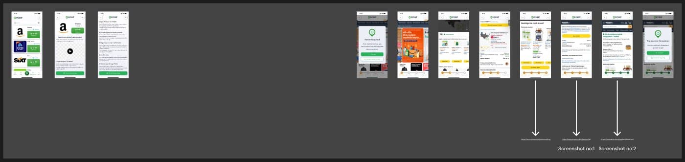
▸ scroll — Amazon in-app OCR shopping flow · Step 0–7 · persistent tracking bar
Detail
Production screens
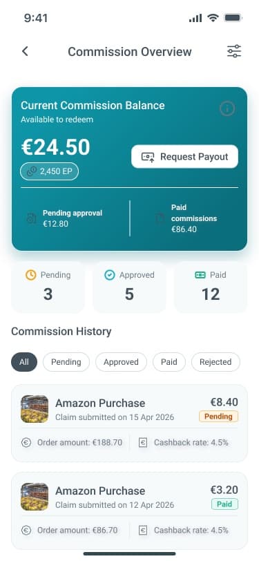
A few of the shipped v4 surfaces: the flyer template library in both design generations, commission overview for dealer growth, and OTP entry from the passwordless system.
Delivery & quality
Design is done when it ships — and survives regression
Requirements become structured Trello/Jira work with acceptance criteria; designs ship with engineering handoff notes covering async states, validation and i18n across four languages.
A 253-test Maestro UI suite and 9-persona regression reviews guard the product. When a release candidate breaks a dealer workflow, it is a board card with a screen recording — not a Slack rumor.
Outcome
verified, qualitative where honest- 01
One canonical product map that ended 'does this screen exist?' conversations and anchored the v2 rebuild.
- 02
V4 features designed production-ready inside the legacy system — zero visual-language debt, flyer generator implemented end to end.
- 03
Hard business logic — VAT, activation, payouts — turned into explicit designed states and handoff specs.
- 04
A regression-tested product: 253 automated UI tests plus persona-based review rounds feeding the QA board.
More projects
ePOINT v2.0
Rebuilding a live product as a token-driven design system
Read case →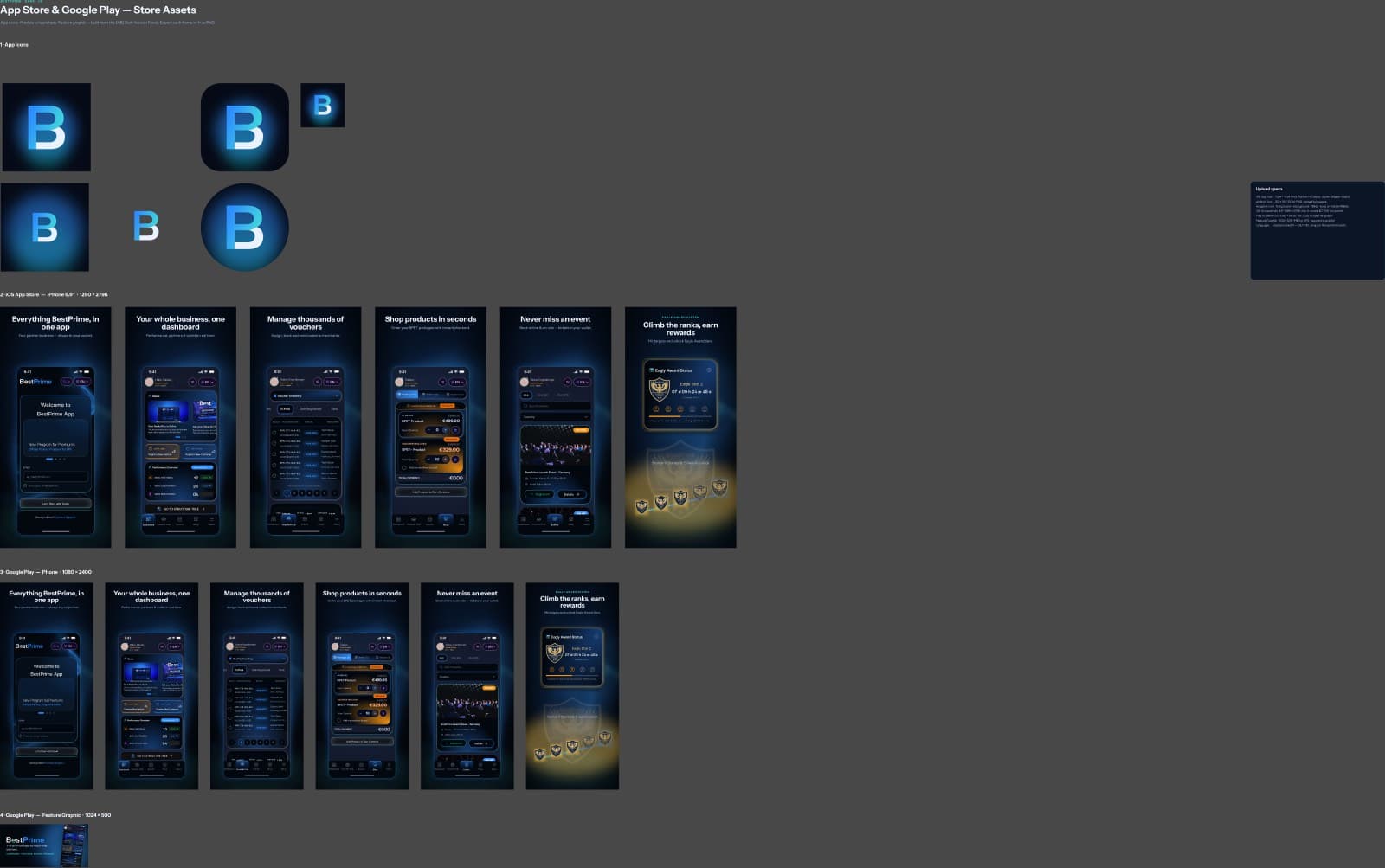
BestPrime
A premium dark partner platform, made ready for the app stores
Read case →DecentraHubs
Running a product studio — from brand systems to shipped software
Read case →