Partner & distributor platform — art direction & launch kit
A premium dark partner platform, made ready for the app stores
The partner side of the ecosystem: a network business that needed to feel premium, energetic and operational — deep navy grounds, aurora light, dashboards, voucher inventory, events and a five-shield rank system, plus a complete App Store / Play launch kit.
Backdrop — the actual working file
- Role
- Art Direction · UI Design · Store Launch Kit
- Client
- BestPrime · partner network
- Period
- 2026
- Platforms
- iOS · Android · Web (1440)
- Tools
- Figma · Instrument Sans · Darker Grotesque
- Status
- Store launch kit delivered
Overview
BestPrime is the partner and distributor side of the ecosystem — the people who grow the merchant network. The direction had one brief: premium, energetic, operational. Deep navy grounds, electric blue and teal aurora light, Instrument Sans.
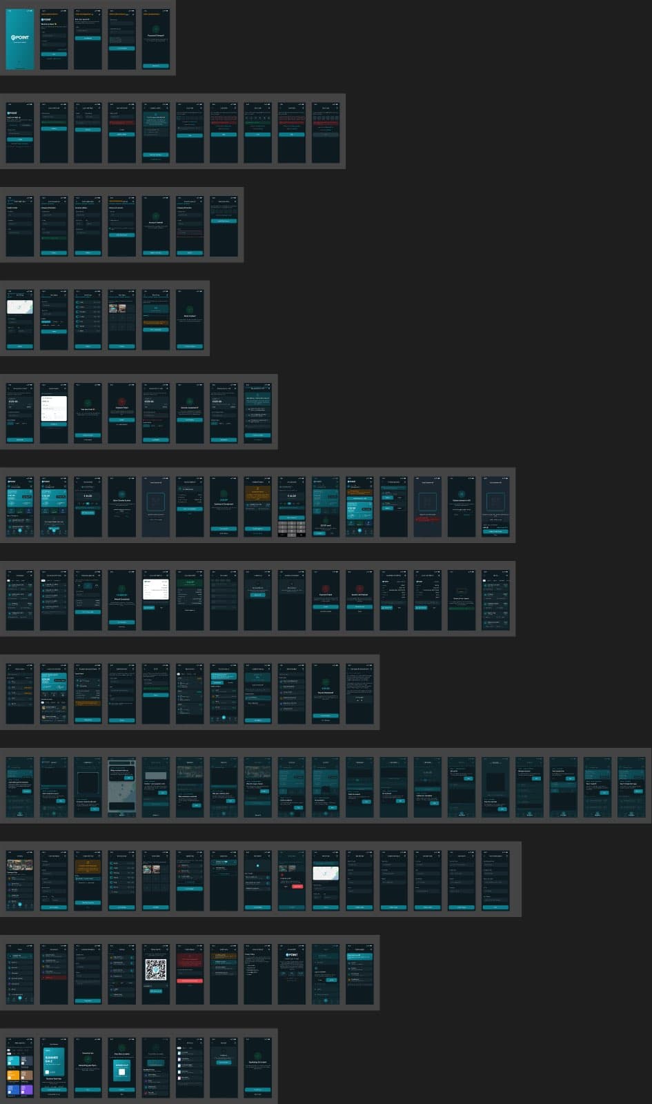
The product surface is genuinely operational: performance dashboards with structure trees (downline networks), a 1,200-unit voucher inventory hub, events with Apple Wallet tickets, a product shop, and the five-shield Eagle Award rank ladder.
Scope
- Visual direction (dark premium)
- Mobile + web app surfaces
- App Store & Play asset system
- Icon system & feature graphic
- Preview narrative design
The challenge
Dark, premium and legible rarely coexist. Network-business tools drift into either spreadsheet grimness or crypto-casino glow. The direction had to make an operational product feel aspirational without losing data clarity.
The store launch kit had a second-order problem: backgrounds that looked 'designed' but generic. The answer came from the brand itself.
My role
Art direction and UI design on the dark 'Premium/Energic/Operational' direction, and full production of the store launch kit.
The product design authorship is shared with the wider team; this case is framed honestly as art direction, UI contribution and launch production rather than sole product ownership.
Product decisions
3 that shaped the productBuild store backgrounds from the brand's own splash textures — the 'Aurora Plasma Field'.
WhyStock gradients make every app look like every other app; the brand already had distinctive plasma light in its splash assets.
ImpactLayered, blurred and re-lit brand textures gave 12 phone previews and the feature graphic depth and atmosphere with zero stock art — tuned per screenshot so headlines stay legible.
Design the preview set as a narrative, not a screenshot dump.
WhyStore visitors decide in seconds; six previews should tell one story.
ImpactWelcome → Dashboard → Vouchers → Shop → Events → Eagle Award: a sequence that walks from first impression to ambition, with the rank-climb spotlight as the closer.
Give the Eagle Award preview its own composition system — the ascension ladder.
WhyRank systems are the emotional engine of network businesses; a flat card undersells them.
ImpactA five-shield climbing ladder with the current rank lit gold, locked ranks dimmed, and the top rank as a target glow — gamification rendered with restraint.
Product surface
Operational, but never gray
Dashboards carry performance overviews, structure trees and wallet state; the voucher hub tracks inventory across pool, self-registered and sent states; events handle booking with wallet tickets; the shop sells partner products with flash-sale mechanics.
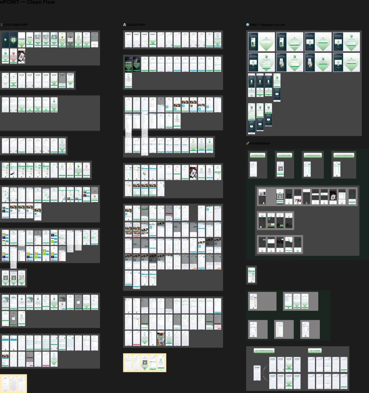
Web app
The same direction at 1440
The web app carries the direction to desktop: performance, news, wallet and Eagle status on one operational home, with the shop as a second surface.
Store launch kit
From product to storefront
iOS and adaptive Android icons, six App Store previews at 1290×2796, six Play previews, and a feature graphic — one template system with per-theme narratives, captioned in English with DE/IT/EL derivable from the same templates.
Preview narrative
Six screens, one story
Each preview pairs a headline with a floating device over the aurora field — welcome, operate, reward, ascend. The Eagle Award closer uses the gold ascension ladder.
Screen wall
Dark Version Finals
The full wall: dashboard, voucher hub, events, shop and rank system in the final dark direction.
▸ scroll — Dark Version Finals — the full screen wall
Outcome
verified, qualitative where honest- 01
A complete, consistent store presence: icon system, twelve previews and feature graphic delivered as one template family.
- 02
Backgrounds built from brand-owned textures — distinctive at thumbnail size, legible at full size.
- 03
An art direction the product team can extend: rules for glow, depth and hierarchy rather than one-off compositions.